top of page
the magic ipod
A two day personal design challenge where I redesigned The Magic iPod, a slice of 2000's interactive internet nostalgia.
year
2021
SCOPE OF WORK
UI/UX Design
TOOLS:
Adobe XD, Adobe Illustrator
The Rebrand
A two day personal design challenge where I sought to redesign The Magic iPod, a little slice of 2000s interactive nostalgia that I loved.
The design of the current site, while straightforward, is very minimal where users are prompted to click and drag one song on the left of the screen over another song to the right that "creates" a mashup of the two songs that play at the top of the screen.
In my redesign, I sought to maintain the simplicity of the original site while introducing more interactive elements and a brand new look and aesthetic.

The original landing page for The Magic iPod.
Initial Concept Exploration
In keeping with the one-screen integrity and click-and-drag feature of the original site, I wanted to emphasize the mashup aspect and the idea of a Venn diagram where users can click and drop song choices into the middle aligned with this vision.
Something I noted after my initial design from the original site was that there were two clearly delineated groups of songs. While users could click and drag songs from List 1 to List 2, they could not do the reverse. This meant that users who wanted to make a mashup from a song in List 2 had to go through each song individually from List 1 to see if they were compatible.

Secondary Concept Exploration
In line with the name of the site which calls to mind days when iPods and other digital music players were a mainstay compared to today's modern smartphone, I wanted to introduce an element of nostalgia with an image of the iPod with the classic scroll wheel.
Rather than the one-screen display of the original site, each subsequent screen would follow a linear process leading to a final play screen.

Mid-fidelity Design
I proceeded with my initial design exploration as I quite liked that the Venn Diagram emphasized the mashup aspect.
After running through several design tweaks however, I ended up scrapping the play button and timeline until users could actually play their mashup to lessen confusion.

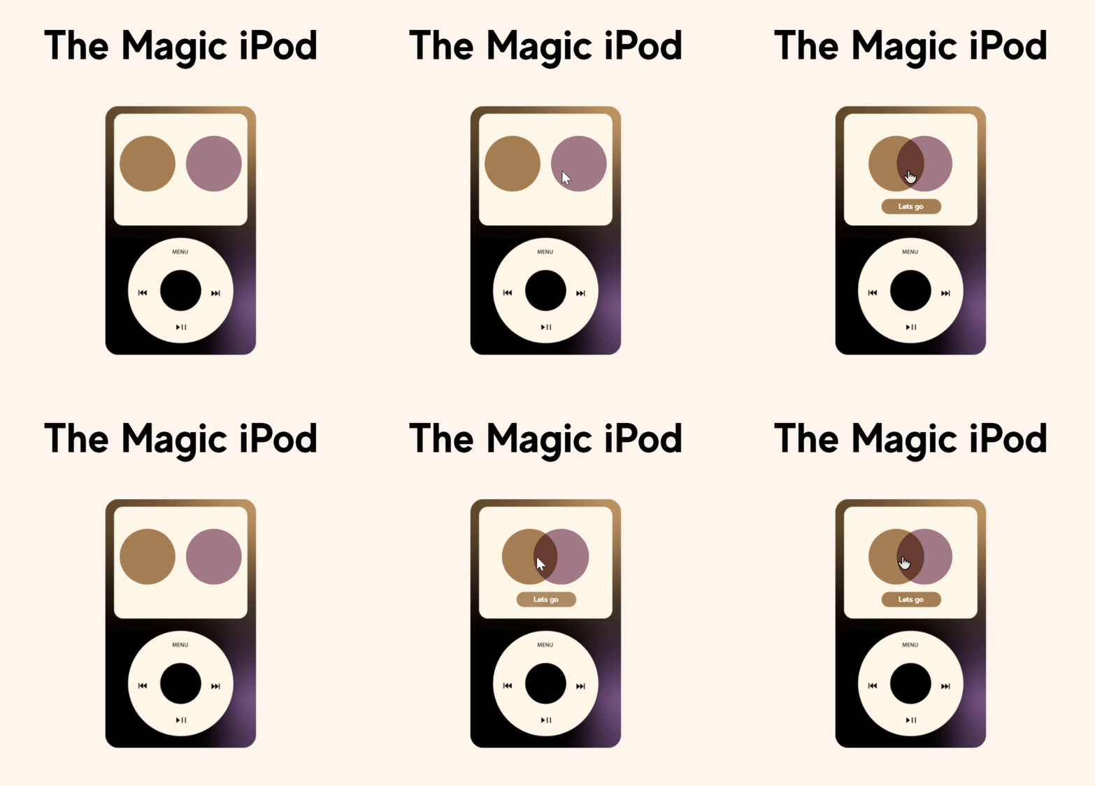
After soliciting feedback regarding my initial designs from five of my peers, I designed and included a visual of an actual iPod along with an animation which demonstrates two circles joining together in a Venn Diagram, priming users to how the Magic iPod would function.


.png)

Final Design
Demo the prototype below.
Built using Adobe XD and Adobe Illustrator
Final Screens

bottom of page


